Hi! I'm completely done with filming... Well, I was. But I had to Re-shoot the final portion of the scene (
The Art Store) and I'm going to tell you all about it.
But first, a small disclaimer:
For obvious reasons I had to leave my house to film this scene,. I know that with the Coronavirus happening I'm supposed to stay home as much as I can. Don't worry, I still was careful in my surroundings, and while filming I made sure to keep my distance from other people.
Also, my mom was already going to the store because she needed to buy groceries :)
Now that I put that aside I have to tell you that most of the information that I included above is pretty much useless since i'm not using the original footage, but I'm going to tell you why.
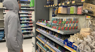
So... I was going over my footage, putting it all together in the editing program (Minor spoiler for my next post) and I wasn't satisfied with how the shots in the store looked like... The background was all wrong and it overall looked muddy.. There was nothing interesting in the composition and the subject was getting lost (I have to admit that this is my fault and my choice of clothing).
Those collections of shots were taken at Walmart and one of the problems is that their prices are fairly low. You may be asking yourself, why is that a problem? If you have been reading my posts you know that one of the themes that I want to explore in my scarcity of resources (economically speaking) of the main character. So having low prices, and I'm talking like less than two dollars, visible on the screen didn't really made much sense for the storyline.
At that point I decided that I had to Re-shoot that scene. I wanted to do it in Michaels because everything there is
Fancy and
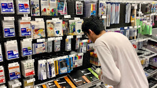
expensive but apparently all of their stores closed temporarily because of the virus. I didn't had a second option so I asked my mom of another store that was similar to Michaels. She gave me two options, either Home Depot or Office Depot. I went with the latter because I think that Home Depot is not the aesthetic that I'm going for with my movie.
The next day we were ready to go to the store (This time with my dad, and I have to mention that he is a much better camera person than my mom) and everything came together.
 |
| Original cut (Walmart) |
 |
| Final cut (Office Depot) |
As you can see from the comparison, the two cuts looks really different. At first I thought that dressing the character all in one neutral color and covering his face would help with to create some mystery. Even though that may be the case for the scene I think that he gets lost in the scene. For the final cut I kept the neutral color but I went with a lighter tone and I think that it works much better. Also, instead of covering his face I just tried to not show it and I think that it still works great.
I'm glad that I was able to re shoot that scene because I'm much more satisfied with the final product than with the original one.
I think that the items in the background are much more visible and that helps to tie the scene together.
 Probably the most difficult part was figuring out the placement of the text. I also have to mention how annoyed I am with Wevideo because apparently I can only use the fonts that they offer in the website... The problem is that I realized that after downloading a bunch of fonts, so I had to settle with the one that you see on screen.

 Let's get back to discussing how the filming went... It definitely took longer than I expected but I think it's because what I was filming was not a linear story but rather capturing snapshots of a bigger scene (cue the se7en intro). I still needed to create a setting where all of those moments took place in order to tie everything together... And that is how The Happy Little Corner was born.